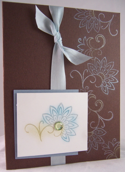
Hue’s of Blue
Jun 3, 2007I absolutely love this Trio of cards I’m posting today! Brown and pale blues are a favrotie combo of mine. When I first saw Bordering Blue I thought EW! BORING! But the more I worked with it I grew to LOVE it.
Flutterflower

This was the first card that I did when I realized the Paisley from Jolies Fleur was indeed a GORGEOUS butterfly. SADLY this card was a submission reject! What is wrong with these people? LOL!
I stamped the butterfly with my Glue pad. Sprinkled my Martha Stewart Blue Topaz glitter. Adhered a jewel in the flower center.
I then made the flutter trial by using an Onare piercing template. Obviously I LOVE this tool. I can’t NOT use it. I’m bad at free handing anything. Seriously I can’t even doodle a descent WHIMSICAL border! THAT people is why I stamp! I have no creative abilities if it involves ME being the artist.
The card base was done using Martha Stewart’s cardstock in like a pale green. The gorgeous inspiration came from the K&co Amy Butler designer paper, and Fabric brads. I thought the brads balanced the design, and made the butterfly look like it were going towards them.
The sentiment is from Au Naturale. Stamped with the versamagic Aegean Blue ink. PERFECT match!
The ribbon is also Martha Stewart. I think I have about every color in this type of ribbon now-
I swear Im going to email her! I have so much money invested in her products! I got a project accepted for publication using them and when its published in December I’m hoping to get a kickback! LOL!
Now we come to out next design
Popped Pearlescent Fleur
I absolutely love my Pebbles Shimmer Pearlescent Chalk. I LOVE making colors POP on a dark color. I found you achieve the best results doing POPPIN PASTELS if you use WHITE craft ink or WHITE StazOn (rather than versamark) cause it gives the color something to hold onto.
I was reminded of this technique when I saw the tutorial on SCS (listed above).
Since purchasing both sets of the pearlescent chalks I haven’t touched my regular SU! ones. I LOVE shimmer-if you read this blog or check my work at all I think its MORE than obvious! LOL!
So I stamped my flowers from Jolies Fleur, along the right side, and POPPED them with my pearlescent chalks. SO PRETTY! The outter petals are done in a darker shade then the smaller petals (more apparent IRL). Of course the bling by K & co finishes it off. This is a very simple ALL OCCASION card.
I tied on the same MS ribbon, then made the focal image pop on the white layer. The layer is my bordering blue cardstock by SU!
Pattern of inspiration-

I got this paper at a LSS. It was what inspired my card JUST above it. Isn’t it fabulous! Unfortunately I have NO CLUE who makes it, as there was only the one sheet.
Pretty much the same idea as above. Flower is popped with my pearlescent chalks.
The twill ribbon is-you guessed it Martha Stewart.
I hope you enjoyed my trio.
I want to know what technique you LOVE but NEGLECT to do as often as you use to. I’d like to randomly select one and feature a card using YOUR favorite technique.
So please REPLY!
Have a great Sunday. We are off to do something with the kids.

My Etsy

Who I Designed For
Blogroll
- Alicia
- Alli Miles
- Ally Blankenship
- Amber
- Andi @ crafts on a whim
- Angel R
- Angie Z
- Anne Kranitz
- Becky O
- Bee
- Beth Silaka
- Bethany Paull
- Beverly Nash
- Bobbie
- Cambria
- Cammie
- Card of the Week
- Card Positioning System (CPS)
- Cards for Cancer
- Catherine Doucette
- Charmaine
- Cheryl Sims
- Chriss Rollins
- Christina
- Christine Ewing
- Christine Wooden
- Colleen Schaan
- Craft Critique
- Craft Gossip
- Crystal
- Dawn Easton
- Emily Giovanni
- Geny
- Holly
- Igne Groot
- Inspirational Craft Blogs
- Irene
- Jami Sibley
- Jeanne Streiff
- Jen del Muro
- Jeni Bond
- JenMarie
- Jenn Balcer
- Jenn Diercks
- Jenn O
- Jennifer E
- Jennifer Mick
- Jennifer Pereda
- Jennifer-Sweet Treat
- Joanne Basile
- Jodi Collins
- Julia Stainton
- Julie Masse
- Karen
- Kathryn Berthiaume
- Katie Cotton
- Kelley Holland
- Kendra
- Kim Scholfield
- Kris’s Color Stripes! Get inspired here
- Kristen Dubosque
- Kristin Eberline
- Kristine
- Laura @ Sunshine Stamper
- Laura Turnmire
- Laurie Schmidlin
- Lesa Rapp
- Linda Duke
- Linda-LSN
- Lindsey Botkin
- Lisa (lakind scs)
- Lisa Kind
- Lori Craig
- Maggie
- Mara Campbell
- Maria
- Maria Levine
- Mary
- MaryJo
- Melanie M
- Monique Hansen
- Moxie Fab World
- Pam Imholz
- PaperCrafts Connection
- Peppers and Pollywogs Kids party site
- Rebecca Grohall
- Rita
- Robyn
- Rose Ann
- Sarah Vrolyk
- Sharon Harnist
- Sharon Johnson
- Sharon Rivera (a chemisrty with paper)
- Sherrie
- Sophia Landry
- Storage Units, Ink, & More Blog
- Sue Berker
- Susan (Rainy)
- Tangii Crane
- Tracy
- Tricia Traxler
- Trudee
- Velta
- VivLyn
- Zena
MTME Pretty Palette Color Team
MTME Pretty Patterns Sketch Team
My Time Made Easy TM LLC
Shop till you drop!
Lauren Meader
About Me
Copyrighted material
Subscribe To My Blog
Pages
- About me
- Alexa’s Story!
- My Crafty Corner!
- My Time Made Easy™ LLC
- Our Make A Wish Trip to Disney!
- Resume/Publication List
Calendar
Archives
- August 2013
- July 2013
- June 2013
- May 2013
- April 2013
- March 2013
- February 2013
- January 2013
- December 2012
- November 2012
- October 2012
- September 2012
- August 2012
- July 2012
- June 2012
- May 2012
- April 2012
- March 2012
- February 2012
- January 2012
- December 2011
- November 2011
- October 2011
- September 2011
- August 2011
- July 2011
- June 2011
- May 2011
- April 2011
- March 2011
- February 2011
- January 2011
- December 2010
- November 2010
- October 2010
- September 2010
- August 2010
- July 2010
- June 2010
- May 2010
- April 2010
- March 2010
- February 2010
- January 2010
- December 2009
- November 2009
- October 2009
- September 2009
- August 2009
- July 2009
- June 2009
- May 2009
- April 2009
- March 2009
- February 2009
- January 2009
- December 2008
- November 2008
- October 2008
- September 2008
- August 2008
- July 2008
- June 2008
- May 2008
- April 2008
- March 2008
- February 2008
- January 2008
- December 2007
- November 2007
- October 2007
- September 2007
- August 2007
- July 2007
- June 2007
- May 2007
- April 2007
- March 2007
- January 2007
Categories
- About Me
- All That Scraps
- blogger challenge
- camera/photo play
- Cards
- Contests
- family stuff
- FOR SALE
- Home decor/3-D items
- How to FAKE it!
- Introduction
- JUGS Challenge
- JustRite Stampers
- Lizzie Anne Designs
- My family stuff
- My Stamping Space
- My Time Made Easy
- My Time To Color Challenge
- My Time to Create Challenge
- My Timeless Template Challenge
- My Timeless Templates
- Mytime Mail
- MYTIME MOVIE/VIDEOs
- Papertrey Newsletter
- Pink Cat Studio
- Pretty Palette Challenge
- Pretty Patterns Sketch
- Product Opinions and Must haves
- Recipe's
- Saturday Sketch
- Smilebox Creations
- Stampavie
- Tutorials
- Uncategorized
- videos
Most Popular
- Create your own Onesie Card Tutorial-and important NOTE! PLEASE READ (2529)
- Saturday Sketch-Boxed bag holder (2333)
- Going GREEN! Fancy Flower Flourish-Closure Video (1478)
- Fabulous Favorite - Giveaway! (1336)
- a Prayer Request (1232)
- QUICK-Easter Baskets from Nestabilities-PTI style-and blog challenge (1063)
- Teaser Sketch (999)
- February Release Giveway! (and a little peek) (996)
- Group Post and Rambling Rose Video Tutorial (985)
- GIVEAWAY! Who wants it all?! (895)
Recent Comments (RSS)
- 첫충사이트: 완전히 흥미로운 블로그 게시입니다. 저는
- sarah: Wow, Lauren, what a stunning
- hedie: خرید راهبند
- 야동: Love to read it,Waiting For
- 야동: This seller is in a
- 바카라사이트: 여기 처음 왔어요. 나는이 게시판을
- 야동티비: I was surfing the Internet
- 바카라사이트: 비슷한 주제에 대한 흥미로운 정보를
- 바카라사이트: "여기에 제공해 주신 귀중한 정보와
- 온라인홀덤: 유익한 웹 사이트를 게시하는 데
Copyright © 2007 - My Time, My Creations, My Stampendence - is proudly powered by WordPress
This blog has been Tweaked and Designed by Sara Williams
10 Responses for "Hue’s of Blue"
Beautiful cards and great color combo! I love brown as an accent to any color.
As usual, very nice work Lauren!
Beautiful cards. Love blue and brown together.
Wow, the paper you used on the last card looks fabulous! I can see that it would be inspiring. All three are very beautiful and you are making me want to head over to Michaels and purchase some MS products!!!! Bad girl! But, I love it anyway. My favorite technique is actually cracked glass…I am a lover of the old, well-used, well-worn, well-loved look, and it just fits that style. I used to do it quite often, but haven’t done so for awhile…hummm, maybe I need to work on that! Thanks for sharing your creativity. Barb g
Just oh so beautiful!! Love the colours together!
Great work as usual!!
I LOVE the fabric brads from K&Co. They remind me of Jan Brett’s books. Beautiful cards, and the glittery butterfly is wonderful. I love the look of watercolor on watercolor paper…garden scenes with lots of flowers or pastoral scenes with trees, sky, etc. I don’t take the time to get my supplies out and play with my fun stamps for watercolor technique from Art Impressions. Maybe I’ll make that my goal this week! Thanks for sharing your cards.
Great colors, great cards! They are so pretty! I love those brads on the first one…been drooling, but haven’t bought, cuz’ I didn’t think I couldn’t make them work.
Thanks for sharing these lovelies!! AND btw – whoever rejected that first one….dopey. It’s stunning!
Hope you enjoyed your time with the kids!
Gorgeous cards Lauren. I love all the shades of blue so these really got me.
Lauren, More beauties. My neglected technique? Hmm…up until recently I would have said watercoloring, but lately that’s all I do. So how about embossing? It sometimes is a nice touch, but I rarely do it anymore.
Wearing erotic and Sexy Hot Lingerie can make any woman feel good. It can also add intimacy and variation to your sexual experience. There are so many different styles, colors and types to choose from that you are guaranteed to find some type of Wholesale Lingerie that works for you. The best part is that erotic lingerie makes a great gift.
Leave a reply