Archive for June, 2007
Funk-tified Fun
Jun 6, 2007 Author: mytime | Filed under: Cards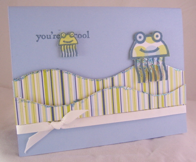
So COOL-
I made these a little while ago. Haven’t had any MYTIME in a few days. Bridal Shower obligations. So thought it would be a perfect time to share these.
Anyway, I love these funky designs. They are from the Holy Tomoli set.
I also LOVE the CM Wavy paper cutter. It is a must have for me.
I made the “waves” on the You’re Cool card using it. They were then touched with some stickles. I used this image as a little Jelly Fish. I love it. I love the simplicity of it too. Great KID card.
The paper is by Memory Box Beach collection. I got it at a stamp expo and NEED more!
Hi-

I was playing around with the mouse and cheese image. While creating this, in my head popped the “How you doin” (Joey from friends voice). And that was what I thought that little mouse was thinking when it saw the cheese! LOL! Is that “cheesy” OK Enough I know! LOL!
Anyway……….Just havin fun with these designs. I had the clear tag from JoAnn’s $1 spot FOREVER and decided to use it. The mouse has some bling on the nose.
Paper is also Memory Box the Sugar (?) colletcion which it paper to DIE for! LOVE it!
So I hope these hold you over till later or tomorrow. I have some fun things I hope to share with you all.
Thanks for checkin in-
Lovely Lizzie Anne-again
Jun 4, 2007 Author: mytime | Filed under: Cards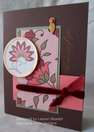
La Fleur De Leis
This is as french as its gets (my title that is)! Heck it may not even be spelled right! LOL!
Colors-Chocolate Chip, Cameo Coral, Burgundy, Mello Moss and copper tones.
I love this set by Lizzie Anne called Jolies Fleur. I know you are probably thinking how many cards can you possibly make? Well ALOT! Isnt that the point. We buy stamps to get our mileage out of them. I plan on inking this OLD! LOL!
As you’ve noticed I cant put this particular set down. This card started with this paper by American Crafts in Rosemary from their Ala Mose Collection. SO AMAZINGLY DELICIOUS.
It is actually a pink patterned paper, with the pattern in brown. I took my Prismacolor markers and colored the paper! NOW, Its like a whole new patterned paper!
After it was colored I pulled out my Jolies Fleur. I stamped it in a versamagic ink injumbo java. Then with the same Prismacolor markers, colored in the bloom. I then used my Making Memories tag maker, for the copper tag.
I had to add some glitter so, with my Martha Stewart glue pen (superior to the SU one for sure) I traced the places I wanted my bling-then sprinkled my dazzling diamonds-which I actually prefer to the Martha Stewart crystal type glitter.
Sentiment is stamped in copper ink and is from the Simply Sentiments set. The Hodge podge hardware was dipped in copper ink. The brad was colored with a sharpie marker!
Ribbon is by May Arts.
I promise new samples with other sets! LOL!
Like this one-
Shore do Wish
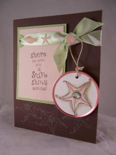
I think this is the BOMB! Sorry, I just do!
Colors-Choc. Chip, Certain Celery, Blush Blossom
Stamp set is called Shore Thoughts. I LOVE this set. SO whimsical and elegant all at the same time.
I love the colors. How the brown makes the rest just POP! I also LOVE all the sparkle this card has.
This was yet another reject. That means yeah I get to keep it!
Again, I made my own tag. Colored star fish with versamagic ink and fantastix brush.
Added some glitter from Martha Stewart, on star fish, and along bottom. Not to mention some much needed bling.
The ribbon is from Michaels. Ive had it FOREVER!
Hope you like the eye candy.
See you tomorrow!
Hue’s of Blue
Jun 3, 2007 Author: mytime | Filed under: CardsI absolutely love this Trio of cards I’m posting today! Brown and pale blues are a favrotie combo of mine. When I first saw Bordering Blue I thought EW! BORING! But the more I worked with it I grew to LOVE it.
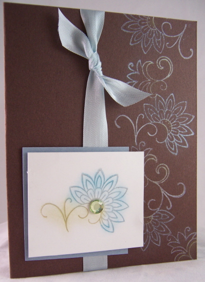
Flutterflower

This was the first card that I did when I realized the Paisley from Jolies Fleur was indeed a GORGEOUS butterfly. SADLY this card was a submission reject! What is wrong with these people? LOL!
I stamped the butterfly with my Glue pad. Sprinkled my Martha Stewart Blue Topaz glitter. Adhered a jewel in the flower center.
I then made the flutter trial by using an Onare piercing template. Obviously I LOVE this tool. I can’t NOT use it. I’m bad at free handing anything. Seriously I can’t even doodle a descent WHIMSICAL border! THAT people is why I stamp! I have no creative abilities if it involves ME being the artist.
The card base was done using Martha Stewart’s cardstock in like a pale green. The gorgeous inspiration came from the K&co Amy Butler designer paper, and Fabric brads. I thought the brads balanced the design, and made the butterfly look like it were going towards them.
The sentiment is from Au Naturale. Stamped with the versamagic Aegean Blue ink. PERFECT match!
The ribbon is also Martha Stewart. I think I have about every color in this type of ribbon now-
I swear Im going to email her! I have so much money invested in her products! I got a project accepted for publication using them and when its published in December I’m hoping to get a kickback! LOL!
Now we come to out next design
Popped Pearlescent Fleur
I absolutely love my Pebbles Shimmer Pearlescent Chalk. I LOVE making colors POP on a dark color. I found you achieve the best results doing POPPIN PASTELS if you use WHITE craft ink or WHITE StazOn (rather than versamark) cause it gives the color something to hold onto.
I was reminded of this technique when I saw the tutorial on SCS (listed above).
Since purchasing both sets of the pearlescent chalks I haven’t touched my regular SU! ones. I LOVE shimmer-if you read this blog or check my work at all I think its MORE than obvious! LOL!
So I stamped my flowers from Jolies Fleur, along the right side, and POPPED them with my pearlescent chalks. SO PRETTY! The outter petals are done in a darker shade then the smaller petals (more apparent IRL). Of course the bling by K & co finishes it off. This is a very simple ALL OCCASION card.
I tied on the same MS ribbon, then made the focal image pop on the white layer. The layer is my bordering blue cardstock by SU!
Pattern of inspiration-

I got this paper at a LSS. It was what inspired my card JUST above it. Isn’t it fabulous! Unfortunately I have NO CLUE who makes it, as there was only the one sheet.
Pretty much the same idea as above. Flower is popped with my pearlescent chalks.
The twill ribbon is-you guessed it Martha Stewart.
I hope you enjoyed my trio.
I want to know what technique you LOVE but NEGLECT to do as often as you use to. I’d like to randomly select one and feature a card using YOUR favorite technique.
So please REPLY!
Have a great Sunday. We are off to do something with the kids.
Bridal shower card deliemma! UPDATE and another request for help!
Jun 2, 2007 Author: mytime | Filed under: My family stuffWOW all the responses have been SOOOOO helpful. THANK YOU SO MUCH!!!! SERIOSULY!
I asked you all for opinions on the card I should choose for my SIL bridal shower invites and I was so happy to get your feedback.
Looks like most of the recommendations are for #2. The one with patterned paper. So, I went to the craft store, and ya know what NO PAPER!!!!!!!!!!!!!!!!!!!!!!!! Im now wondering if I got it at a stamp expo! OH gosh whats a girl to do.
OMG! I was a Rage-ing maniac! TYRING to find a place to order it. I have no clue. Its by American Crafts Ala Carte collection in Baguette. Im so upset.
So Now I will have no choice but to go with #1. I love that one so its ok. I just got the idea set that I would use #2! I am however going to add their initials behind the love sentiment. Everyone seems to agree its awesome! AND I think I found an amazing ribbon too.
I also hope to soon share in favors for the shower and whatnot. AND my center piece ideas (dont ask cause I dont know yet) The favors I am doing chocolate flower molds and stamping clear boxes with the flower on the card in the carribean color with the love sentiment and their initals on the tags tied around the clear boxes. So each box with have several colored chocolate flowers. I think they will look really pretty.
We still arent sure WHERE its being held! I left a message at our town community center and need to hear back-so I cant do anything till the place is booked. WHY? Because they cardstock goes through the printer FIRST! EEEK! Time is ticking.
PLUS I dont even have the invitation list yet.
OH man wedding nightmares here I come. Im not in the wedding and this is totally stressin me.
MORE HELP NEEDED!
OK People you are invaluable to me. I am donating my time at the Relay for Life in our area on June 23rd from 7pm-10pm (if you live in the area and want to help call me!). This is a huge event for Cancer research/support for everyone affected.
Anyway-I was asked to do a stamping project with people who attend. Who ever participates.
When I did the Walk for Breast Cancer I did book markers and people could choose a variety of stamps all that worked well with the same colors (pink and greens) anyway…….
WHAT ON EARTH SHOULD I DO?
It has to be something that people dont need much direction for and can do quickly.
I think Im too into WOW factor stuff to think simple. Ya know like the first time you saw embossing, then you forget about it for a while!!!!!!!!!!!!!!
I was thinking, Hershey candy bar wrapper (that could get ugly though) Luggage name tags, um that it! LOL! I really do not know!
So if YOU were attending an event what would be a cool thing to do using stamps as a keepsake?
Oh Another thought how about a wishing stone/magnet/ They could stamp a word or image, then stick it under a flat marble and attach a magnet? Is that LAME?????
OK I am really thinking out loud here.
If you are still reading-thanks! Im boring myself.
Well Check in tomorrow Im featuring 3 cards using Hue’s of Blue. They are LOVELY. And yes-its all using Lizzie Anne sets-I just cant help it, and it hasnt been a week yet! 2 more days of Lizzie Anne (at least! LOL!) I really love the new sets. Can ya tell?
Have a good night.

Well its that time again!!!
I adore this Motorcycle image from the All Guy set by Lizzie Anne Designs, and the sentiment is Simply Sentiments. Its an AWESOME guy set. I made this card for Jason’s friend. He was turning 29!
I have used this set a while ago as well so here is a link to the cards from then. I hope it gives you more ideas.
The technique I used on this is called the “Donna”. Its when you stamp an image, then without re-inking keep stamping it closely together. I barely move the stamp and do it rather quickly. This makes the motor cycle seem to be in motion.
The bike was stamped (using Pallette ink in black), colored (with my Prismacolor markers), cut and layers 3 times. Each time cutting a different section for a more realisitc look.
I made the cloud coming out the back by using my 3/4 hole punch, and making a mask! Cool huh? Then just sponged some Saharah sand ink.
The patterned paper is by Imaginisce the Black Tie Optional collection.
I stitched ribbon is from www.ribbonsandbowsohmy.com
My card is 6 x 4 1/2. I hope you try the sketch and love it! I thought this card was REALLY cool, as did all the guys at the party. You know you have a winner when a group of men OOGLE a handmade card! ;D
I’ve got some HOT STUFF! My Favortie Things is HERE!
Jun 1, 2007 Author: mytime | Filed under: Cards, Home decor/3-D items, TutorialsWAHOOOOO! Hot Stuff is NOW FOR SALE!!! This is a mini set by My Favorite Things Stamps. It retails for only $9.00!! Now that is cool.
You can buy it from Kim @ MFT (above), or All That Scraps, and eP.
So ready to get enabled?
Here we go!
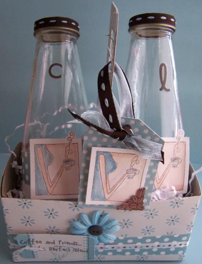
On the Run- This is my Latte set To Go! Not an original idea, but I am proud that I made this cart all my my lonesome! I created my very own template, as I went along. Pretty cute eh?
I used my cardboard from the back of a 12 x 12 paper pack! Scored, cut and I was off. I then just covered it with my SEI Granny’s Kitchen patterned paper.
Cut cardboard 9 x 12
Scored at 3-6-9 (short side)
Then again at 3 – 9- 12.
Trim the edges so it folds in like a cardboard box. Sorry no visuals. Wasn’t planning on a tutorial!
Then wrap with paper of choice. I use my Xyron 900.
For the insert (handle)
Measure 3 inches by (however tall you decide). Score 1 inch from the bottom, then cut in half at bottom to fold.
This will allow you to adhere one flap to the left, and one to the right. This keeps it from falling to one side and keeps it stable.
Cover with Paper. Rounder corners at top, and use Key Tag punch for handle.
Its really EASY! I hope you try it.
Here is another view of it empty.
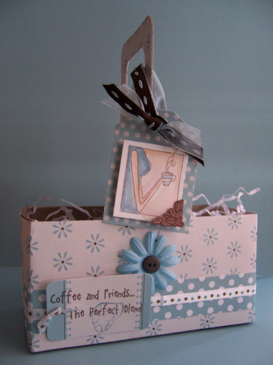
I used elements from the paper pack, and coordinating ribbon. The flower is by Bazzill.
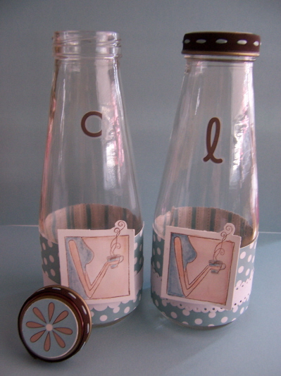
For the Glasses
I just rinsed out some Starbucks coffee drinks.
Made a wrap for them, and decorated to tops.
The stickers are for the friends initals so you know who’s drink is who. For this one I used
L-for Latte
and C-for Coffee.
You can include a coffee mix packet in the set, or just fill with drink of choice! You can alos fill with candy or whatever else you choose!
Let me know what you think!
On the my FAVORITE card with this set
Krafty Blend
OMW! I love this card! Why? Because its not your typical colors for a coffee set. And I love my ingenious name for it! LOL! I have to say my layout is fabulous! I love it. I love all the elements in this. I’m just bouncin over it.
I used the Birdie Collection by Crate paper. Isnt it AMAZING? Im lovin it. I dont use my Kraft cardstock enough.
The flowers are by Prima, the Bubble Blue collection! LOVE them!
The ribbon is (you guessed it) Martha Stewart!
Now for my next favorite!
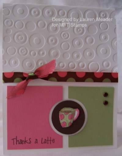
Monochromatic Latte
Colors-Blush Blosson, Pretty In Pink, and Bravo Burgundy. HELLO! I love it!
I thought it was a cool combo for this set. I started using MFT stamps Behind The Scenes (sold at all the listed retailers above and a MUST have) for the dotted bkgd (which uses a pink versamagic ink) and the flower design (done in a chocolate versafine ink). I colored the images with my Prismacolor markers. I used my friend Tracey’sidea for the liquid pearls in the centers of my Prima’s and the flower bkgd image!
I used this ribbon by www.ribbonsandbowsohmy.com .
Isn’t it great?
Now for the next one-
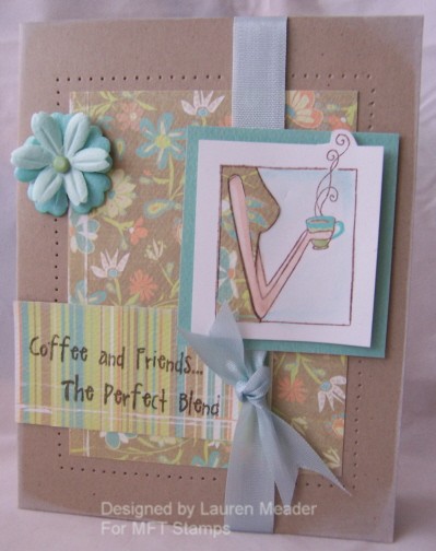
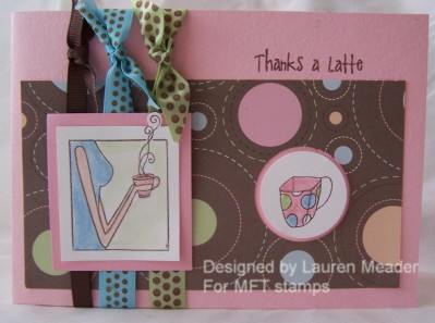
Coffee and Friends

This is like a favorite color combo of mine-regal rose, chocolate chip, certain celery, and white.
My Ribbon is my American Crafts. I was SOOOOO pleased with this layout! I love the coffee cups so much. I also love using circles on my designs. No idea why I just do!
The Girl is pieced onto the celery cardstock.
Announcement inspired-
I was one of the lucky people chosen by Rubber Stamping Fun to be on TEST panel and review their products. Well they recently sent a digital announcement out to everyone for the birth of their new baby girl. Sorry I will not attach it, as I feel it is personal to their family, but that is what inspired my layout for this design! The second I saw it I thought WOW! That could make a cool card!
I had to add the Cuttlebug folder spots & dots to complete the design
So there you have it! I colored my brads with a sharpie so they would be “chocolate” colored! LOL!
The 2 panels (rose-celery) have the circle punched in each 1/2. The Coffee Cup is on a punched out circle piece and on a dimensional. Cool huh?
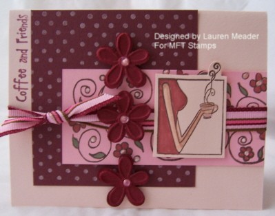
Got 8 minutes?
Against my better judgement I am sharing this one. I would normally have trashed it! LOL!
BUT to show you that not all things are great I decided to share. Definitely NO saving the best for last with this one! Oh, well. Not even sharing the creative process. Just know it took about 8 minutes, and it was my first of the set. So I guess you could call it a warm up card, or a waste of pretty ribbon and patterned paper! LOL!
Dont get me wrong its OK, it just doesnt do the set justice!
Thanks for looking. Let me know what you think. I hope you get some HOT STUFF!
Stay tuned tomorrow-SKETCH CHALLENGE!
HELP! Which one?
Jun 1, 2007 Author: mytime | Filed under: CardsOK I need your help! I have to make about 50-75 Wedding Shower invitations. My SIL wedding colors are Chocolate Chip and Caribbean. SO from these 3 I need to pick ONE design. She has NO THEME, just color preference.
I KNOW these will get chucked in the trash so had to keep it simple. They are ALL easy to mass produce. So be honest! BRUTALLY HONEST. I love the sentiment by SU! Just so Sayings.
Also I am open to ideas for changes or whatever.
Thanks for your help!
ONE
 Set by Lizzie Anne Jolies Fleurs
TWO
THREE
This last one may end up being their shower gift card! LOL! We will see. I personally love #1 most.
Thanks again
My Etsy

Who I Designed For
Blogroll
- Alicia
- Alli Miles
- Ally Blankenship
- Amber
- Andi @ crafts on a whim
- Angel R
- Angie Z
- Anne Kranitz
- Becky O
- Bee
- Beth Silaka
- Bethany Paull
- Beverly Nash
- Bobbie
- Cambria
- Cammie
- Card of the Week
- Card Positioning System (CPS)
- Cards for Cancer
- Catherine Doucette
- Charmaine
- Cheryl Sims
- Chriss Rollins
- Christina
- Christine Ewing
- Christine Wooden
- Colleen Schaan
- Craft Critique
- Craft Gossip
- Crystal
- Dawn Easton
- Emily Giovanni
- Geny
- Holly
- Igne Groot
- Inspirational Craft Blogs
- Irene
- Jami Sibley
- Jeanne Streiff
- Jen del Muro
- Jeni Bond
- JenMarie
- Jenn Balcer
- Jenn Diercks
- Jenn O
- Jennifer E
- Jennifer Mick
- Jennifer Pereda
- Jennifer-Sweet Treat
- Joanne Basile
- Jodi Collins
- Julia Stainton
- Julie Masse
- Karen
- Kathryn Berthiaume
- Katie Cotton
- Kelley Holland
- Kendra
- Kim Scholfield
- Kris’s Color Stripes! Get inspired here
- Kristen Dubosque
- Kristin Eberline
- Kristine
- Laura @ Sunshine Stamper
- Laura Turnmire
- Laurie Schmidlin
- Lesa Rapp
- Linda Duke
- Linda-LSN
- Lindsey Botkin
- Lisa (lakind scs)
- Lisa Kind
- Lori Craig
- Maggie
- Mara Campbell
- Maria
- Maria Levine
- Mary
- MaryJo
- Melanie M
- Monique Hansen
- Moxie Fab World
- Pam Imholz
- PaperCrafts Connection
- Peppers and Pollywogs Kids party site
- Rebecca Grohall
- Rita
- Robyn
- Rose Ann
- Sarah Vrolyk
- Sharon Harnist
- Sharon Johnson
- Sharon Rivera (a chemisrty with paper)
- Sherrie
- Sophia Landry
- Storage Units, Ink, & More Blog
- Sue Berker
- Susan (Rainy)
- Tangii Crane
- Tracy
- Tricia Traxler
- Trudee
- Velta
- VivLyn
- Zena
MTME Pretty Palette Color Team
MTME Pretty Patterns Sketch Team
My Time Made Easy TM LLC
Shop till you drop!
Lauren Meader
About Me
Copyrighted material
Subscribe To My Blog
Pages
- About me
- Alexa’s Story!
- My Crafty Corner!
- My Time Made Easy™ LLC
- Our Make A Wish Trip to Disney!
- Resume/Publication List
Calendar
Archives
- August 2013
- July 2013
- June 2013
- May 2013
- April 2013
- March 2013
- February 2013
- January 2013
- December 2012
- November 2012
- October 2012
- September 2012
- August 2012
- July 2012
- June 2012
- May 2012
- April 2012
- March 2012
- February 2012
- January 2012
- December 2011
- November 2011
- October 2011
- September 2011
- August 2011
- July 2011
- June 2011
- May 2011
- April 2011
- March 2011
- February 2011
- January 2011
- December 2010
- November 2010
- October 2010
- September 2010
- August 2010
- July 2010
- June 2010
- May 2010
- April 2010
- March 2010
- February 2010
- January 2010
- December 2009
- November 2009
- October 2009
- September 2009
- August 2009
- July 2009
- June 2009
- May 2009
- April 2009
- March 2009
- February 2009
- January 2009
- December 2008
- November 2008
- October 2008
- September 2008
- August 2008
- July 2008
- June 2008
- May 2008
- April 2008
- March 2008
- February 2008
- January 2008
- December 2007
- November 2007
- October 2007
- September 2007
- August 2007
- July 2007
- June 2007
- May 2007
- April 2007
- March 2007
- January 2007
Categories
- About Me
- All That Scraps
- blogger challenge
- camera/photo play
- Cards
- Contests
- family stuff
- FOR SALE
- Home decor/3-D items
- How to FAKE it!
- Introduction
- JUGS Challenge
- JustRite Stampers
- Lizzie Anne Designs
- My family stuff
- My Stamping Space
- My Time Made Easy
- My Time To Color Challenge
- My Time to Create Challenge
- My Timeless Template Challenge
- My Timeless Templates
- Mytime Mail
- MYTIME MOVIE/VIDEOs
- Papertrey Newsletter
- Pink Cat Studio
- Pretty Palette Challenge
- Pretty Patterns Sketch
- Product Opinions and Must haves
- Recipe's
- Saturday Sketch
- Smilebox Creations
- Stampavie
- Tutorials
- Uncategorized
- videos
Most Popular
- Create your own Onesie Card Tutorial-and important NOTE! PLEASE READ (2529)
- Saturday Sketch-Boxed bag holder (2333)
- Going GREEN! Fancy Flower Flourish-Closure Video (1478)
- Fabulous Favorite - Giveaway! (1336)
- a Prayer Request (1231)
- QUICK-Easter Baskets from Nestabilities-PTI style-and blog challenge (1063)
- Teaser Sketch (999)
- February Release Giveway! (and a little peek) (996)
- Group Post and Rambling Rose Video Tutorial (985)
- GIVEAWAY! Who wants it all?! (895)
Recent Comments (RSS)
- 야동: Love to read it,Waiting For
- 야동: This seller is in a
- 바카라사이트: 여기 처음 왔어요. 나는이 게시판을
- 야동티비: I was surfing the Internet
- 바카라사이트: 비슷한 주제에 대한 흥미로운 정보를
- 바카라사이트: "여기에 제공해 주신 귀중한 정보와
- 온라인홀덤: 유익한 웹 사이트를 게시하는 데
- 홀덤나라: 나는 당신의 블로그를 정말 좋아합니다.
- lisa: Technology, too, has left an
- 주소모음: 흠 !! 이 블로그는 정말
Copyright © 2007 - My Time, My Creations, My Stampendence - is proudly powered by WordPress
This blog has been Tweaked and Designed by Sara Williams