HELP! Which one?
Jun 1, 2007OK I need your help! I have to make about 50-75 Wedding Shower invitations. My SIL wedding colors are Chocolate Chip and Caribbean. SO from these 3 I need to pick ONE design. She has NO THEME, just color preference.
I KNOW these will get chucked in the trash so had to keep it simple. They are ALL easy to mass produce. So be honest! BRUTALLY HONEST. I love the sentiment by SU! Just so Sayings.
Also I am open to ideas for changes or whatever.
Thanks for your help!
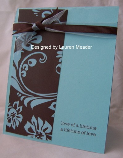
ONE
 Set by Lizzie Anne Jolies Fleurs
TWO
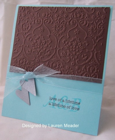
THREE
This last one may end up being their shower gift card! LOL! We will see. I personally love #1 most.
Thanks again

My Etsy

Who I Designed For
Blogroll
- Alicia
- Alli Miles
- Ally Blankenship
- Amber
- Andi @ crafts on a whim
- Angel R
- Angie Z
- Anne Kranitz
- Becky O
- Bee
- Beth Silaka
- Bethany Paull
- Beverly Nash
- Bobbie
- Cambria
- Cammie
- Card of the Week
- Card Positioning System (CPS)
- Cards for Cancer
- Catherine Doucette
- Charmaine
- Cheryl Sims
- Chriss Rollins
- Christina
- Christine Ewing
- Christine Wooden
- Colleen Schaan
- Craft Critique
- Craft Gossip
- Crystal
- Dawn Easton
- Emily Giovanni
- Geny
- Holly
- Igne Groot
- Inspirational Craft Blogs
- Irene
- Jami Sibley
- Jeanne Streiff
- Jen del Muro
- Jeni Bond
- JenMarie
- Jenn Balcer
- Jenn Diercks
- Jenn O
- Jennifer E
- Jennifer Mick
- Jennifer Pereda
- Jennifer-Sweet Treat
- Joanne Basile
- Jodi Collins
- Julia Stainton
- Julie Masse
- Karen
- Kathryn Berthiaume
- Katie Cotton
- Kelley Holland
- Kendra
- Kim Scholfield
- Kris’s Color Stripes! Get inspired here
- Kristen Dubosque
- Kristin Eberline
- Kristine
- Laura @ Sunshine Stamper
- Laura Turnmire
- Laurie Schmidlin
- Lesa Rapp
- Linda Duke
- Linda-LSN
- Lindsey Botkin
- Lisa (lakind scs)
- Lisa Kind
- Lori Craig
- Maggie
- Mara Campbell
- Maria
- Maria Levine
- Mary
- MaryJo
- Melanie M
- Monique Hansen
- Moxie Fab World
- Pam Imholz
- PaperCrafts Connection
- Peppers and Pollywogs Kids party site
- Rebecca Grohall
- Rita
- Robyn
- Rose Ann
- Sarah Vrolyk
- Sharon Harnist
- Sharon Johnson
- Sharon Rivera (a chemisrty with paper)
- Sherrie
- Sophia Landry
- Storage Units, Ink, & More Blog
- Sue Berker
- Susan (Rainy)
- Tangii Crane
- Tracy
- Tricia Traxler
- Trudee
- Velta
- VivLyn
- Zena
MTME Pretty Palette Color Team
MTME Pretty Patterns Sketch Team
My Time Made Easy TM LLC
Shop till you drop!
Lauren Meader
About Me
Copyrighted material
Subscribe To My Blog
Pages
- About me
- Alexa’s Story!
- My Crafty Corner!
- My Time Made Easy™ LLC
- Our Make A Wish Trip to Disney!
- Resume/Publication List
Calendar
Archives
- August 2013
- July 2013
- June 2013
- May 2013
- April 2013
- March 2013
- February 2013
- January 2013
- December 2012
- November 2012
- October 2012
- September 2012
- August 2012
- July 2012
- June 2012
- May 2012
- April 2012
- March 2012
- February 2012
- January 2012
- December 2011
- November 2011
- October 2011
- September 2011
- August 2011
- July 2011
- June 2011
- May 2011
- April 2011
- March 2011
- February 2011
- January 2011
- December 2010
- November 2010
- October 2010
- September 2010
- August 2010
- July 2010
- June 2010
- May 2010
- April 2010
- March 2010
- February 2010
- January 2010
- December 2009
- November 2009
- October 2009
- September 2009
- August 2009
- July 2009
- June 2009
- May 2009
- April 2009
- March 2009
- February 2009
- January 2009
- December 2008
- November 2008
- October 2008
- September 2008
- August 2008
- July 2008
- June 2008
- May 2008
- April 2008
- March 2008
- February 2008
- January 2008
- December 2007
- November 2007
- October 2007
- September 2007
- August 2007
- July 2007
- June 2007
- May 2007
- April 2007
- March 2007
- January 2007
Categories
- About Me
- All That Scraps
- blogger challenge
- camera/photo play
- Cards
- Contests
- family stuff
- FOR SALE
- Home decor/3-D items
- How to FAKE it!
- Introduction
- JUGS Challenge
- JustRite Stampers
- Lizzie Anne Designs
- My family stuff
- My Stamping Space
- My Time Made Easy
- My Time To Color Challenge
- My Time to Create Challenge
- My Timeless Template Challenge
- My Timeless Templates
- Mytime Mail
- MYTIME MOVIE/VIDEOs
- Papertrey Newsletter
- Pink Cat Studio
- Pretty Palette Challenge
- Pretty Patterns Sketch
- Product Opinions and Must haves
- Recipe's
- Saturday Sketch
- Smilebox Creations
- Stampavie
- Tutorials
- Uncategorized
- videos
Most Popular
- Create your own Onesie Card Tutorial-and important NOTE! PLEASE READ (2529)
- Saturday Sketch-Boxed bag holder (2333)
- Going GREEN! Fancy Flower Flourish-Closure Video (1478)
- Fabulous Favorite - Giveaway! (1336)
- a Prayer Request (1232)
- QUICK-Easter Baskets from Nestabilities-PTI style-and blog challenge (1063)
- Teaser Sketch (999)
- February Release Giveway! (and a little peek) (996)
- Group Post and Rambling Rose Video Tutorial (985)
- GIVEAWAY! Who wants it all?! (895)
Recent Comments (RSS)
- hedie: خرید راهبند
- 야동: Love to read it,Waiting For
- 야동: This seller is in a
- 바카라사이트: 여기 처음 왔어요. 나는이 게시판을
- 야동티비: I was surfing the Internet
- 바카라사이트: 비슷한 주제에 대한 흥미로운 정보를
- 바카라사이트: "여기에 제공해 주신 귀중한 정보와
- 온라인홀덤: 유익한 웹 사이트를 게시하는 데
- 홀덤나라: 나는 당신의 블로그를 정말 좋아합니다.
- lisa: Technology, too, has left an
Copyright © 2007 - My Time, My Creations, My Stampendence - is proudly powered by WordPress
This blog has been Tweaked and Designed by Sara Williams
52 Responses for "HELP! Which one?"
I like all of them but I’m partial to the patterned paper in #2.
I think #1 would be the best! I prefer it – simple and elegant.
#2 seems to be missing something! #3 I like the textured embossed, but maybe not in that color? All are very pretty though!!
Well, I go for #3 – love the texture and the color. But whichever is chosen, your sister in law is very lucky….all are wonderful.
Wow … tough choice. They are all beautiful in their own way. I love the simplicity of #1. Maybe it’s just how the picture scanned, but if card #1 is a different color than #2 or #3, I would change the card color to one of those.
Definitely like card number one the best, followed by #2. #1 is classy, as a bridal shower should be. It also seems youthful to me, as most brides are. And I wouldn’t change a single thing with it. It’s gorgeous.
They are all beautiful! But honestly, NUMBER ONE for sure is the best.
All very nice, but #3 really caught my eye. The CB part is elegant, always says “wedding” to me.
I LOVE the first one! The third one is a little too much for me (I am not a fan of that embossing folder) and the 2nd one just doesn’t catch my eye
I love the simplicity of #1 and I think it’s perfect as it is. The other two are also great but you get to save some paper!
~Melissa
I personally like Number 1 – all that caribbean with just a hint of brown. I think it’s the most elegant & feels most like a wedding invitation. I like the cuttlebugged no. 3 idea, but don’t like the combination of colors on it – maybe if the caribbean were cuttlebugged instead?
Yet another vote for $1…I like the bling you added. I think that’s what makes it stand out so much!
I vote for #3. I liked that one the best! But, if you decide to use it for the shower card itself, then #1 is my second choice.
I’m with you. I like the first one the best!
I like #1 the best too. I think it is the bling!! And they better not throw it away!!
Cheryl Sims
Guess I’m in the minority here … but I loved #2!
I like #1 – simple and elegant – and it has bling! And who would throw away a “mytime original”?
I like two because it is striking and memorable. the other two are nice cards, but two is definatly more eye catching.
Definately #2. Love the PP and it’s gonna be nice & easy. Important when you’re mass producing.
I like all of them, but if I have to choose it would be #2. I like the pattern paper. Shame on anyone that throws it away.
I like #1, Lauren. It’s just so pretty and elegant…….very bridal shower-ish!!
I think I’m going to have to go with you and say #1. I just love the sentiment tucked into the flower, and the simplicity of it. My second would be #3, because I like the initials behind the sentiment. All are pretty, though!
All beautiful but the patterned paper on card #2 is perfect. Card has clean and crisp lines, simple but very eye-catching.
Dawn in Canada
I like 1 and 2…I think I like 1 the best, but 2 is an awfully close second… and I think that anyone who would throw away (as Kathie put it) a “mytime original” should be give a good swift slap upside the head! 😉
They’re all beautiful Lauren 🙂
I like #1 the best, then #2. But honestly all three are great.
Lauren – They’re all beautiful but I’d go with #1 first. 🙂
Overall, I like # 2 best, I think. Hard decision! But in card # 3 I really like the way you stamped the initials over the sentiment. That was my favorite specific thing out of all the cards.
Hey Lauren-
I like #1 the best its simple and elegant! but I love the initials behind the sentiment in card #3
#2 would be easiest to mass produce. But I love #1!!
I love #1! It is beautiful for a wedding, but still simple and not over done. I am not too crazy about the patterned paper in #2. The card seems too dark with the chocolate color being the main color on the paper. JMO
I am on board with all of the number..1..votes. I love the little bling you added. I think it is elegant which is perfect for this type of invitation. However number 2 was a close second.
#1 – I like the best
my vote is for #1, the third card would be pretty for your gift too.
I love the first one and second …
they all are beauitful but for the shower plus they will end up in the trash by any account ..I would go with ###1… just my 2 cents..
#1 for the invite, and #3 for the gift
I love them all but if I have to have a choice it would be #1 and my second choice #3. I also love the elegance and simple design of #1, but am drawn to the other 2 as well. Soooo, if you’re throwing the losers away, then just send them my way and I promise to give them to a good home and not the trash! LOL
I like #2 since it’s easy to make.
I *LOVE* #1 – very simple but elegant (the rhinestone brad adds a lot despite it being a small piece on the card – I also like the embossed image). It looks like something out of a professional invite book (in a good way!).
Personally, I don’t like #3 for a wedding invite. I think the large embossed chocolate piece of paper is too heavy, but that’s JMHO. For a regular card to send to a friend, #3 would be fine but for a wedding invite, I think it’s too much. I like someone else’s suggestion to use #3 as a wedding gift card – that would be better.
2. I think the intenser colors works for me.
like em all, but number 1 speaks to me more
don’t forget to let us know!
They’re all beautiful, but I loved number 1 the most…it’s so simple and elegant! Good luck with the mass production!
#1…simple, elegant,a little bit of bling, my first choice.
#3…more elaborate, bold, and would be my first choice IF the recipents would treasure it. Having said that, it may be more work than you would want to do, since they may be trashed…hard to believe anyone would even think about trashing any of these, but, some people just don’t appreciate real ART.
Look forward to seeing your final choice…they are all good, so you can’t go wrong!
Barb g
My favorite is number 3, but if you are already using it, then my second choice is number 1.
Thanks for asking!
MY VOTE IS NUMBER ONE. IT’S EASY, ELEGANT, BUT STYLISH. (HONESTLY, THEY’RE ALL LOVELY.) THANKS FOR ALL THE EYE CANDY!!!
[…] all the responses have been SOOOOO helpful. THANK YOU SO MUCH!!!! […]
I LOVE #2. I would have loved to have that for my wedding invitation.
I love #1. Simple but very elegant. The double ribbon makes it.
Number one is the most eyecatching. It draws your attention in.
I chose number 1, it’s very elegant and perfect for a wedding invite!
Vicky
Oh dear, I really like the simple clean look of number 1, but love number 3 too! Is there anyway you can combine both looks, oooh they are both great, let’s us know what you decide.
All three are beautiful cards, but my favorite is #2. Just LOVE it!!
George…
Wedding bouquets look magnificent as the bride walks down the aisle…
AdSense Money Maker…
Do you know how to make money from AdSense automatically? You don’t!? I’ll teach you how!…
Leave a reply